CITYNEWS REBRAND
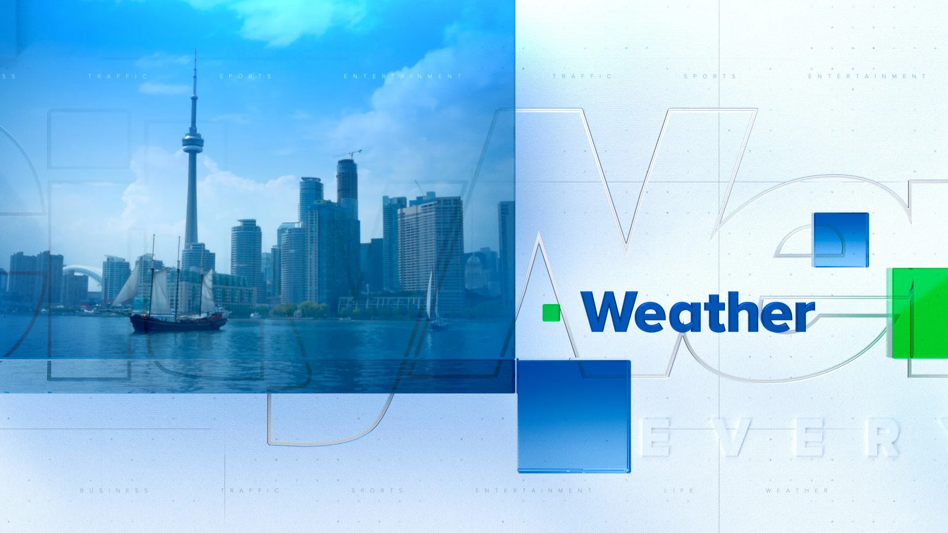
This project was a full rebrand exploration for CityNews, aimed at elevating the network’s visual identity to a more premium and sophisticated level while preserving the core brand colors of navy and green. The challenge was to modernize the look without losing the brand's familiarity or clarity.
Instead of leaning into minimalism, I explored a more layered and refined approach. Subtle materials and texture treatments were introduced to add visual depth, paired with bold typography and strong contrast to ensure information remained quick and easy to read. The result balanced clarity with richness, reflecting a news brand that feels both authoritative and contemporary.
While the design was ultimately not chosen as the final direction, I was pleased with how it came together and how it pushed the brand toward a more elevated and confident visual space.
PROJECT: Network Rebrand
Responsible for Art Direction, Design & Motion